
Our fonts in the wild series is back!! We went scouting for our favorite logos and fonts on the now infamous Abbot Kinney in Venice Beach, California.
We’ve seen Abbot Kinney’s come-up over the years and it’s been nothing less than extraordinary.
This little stretch of angled road used to be home to a dive bar and two smoke shops. Now it houses some of the trendiest shops in LA and was recently voted #1 shopping street in the country. What?!?
Interestingly, many of the logos and fonts we saw here are VERY simple. It makes sense, as luxury brands generally rely more on simplicity, and efficiency in communication has often been the hallmark of high end goods.
But with that said – here are the marks that caught our eye!
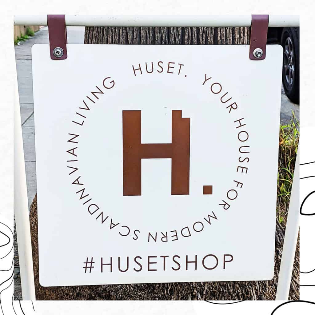
HUSET
How cool is the tiny block cut out of the H to form the period? If you were to see this logo on its own, could you guess what the brand was selling? To us, the H with the cutout takes on the form of a chair. And with this small block there’s definitely a feeling of building a home, or putting things together. This logo makes a ton of sense for a home goods brand. Very clever.
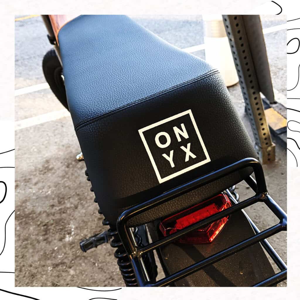
ONYX
Nothing revolutionary here – but the simplicity of the design and the placement on the back of this e-bike seat really stood out for us. As e-bikes have become more popular and electric motors more available, they’ve not only changed the way we commute, they’ve also become ripe ground for interesting design. This particular e-bike had very simple lines and a beautiful wood panel housing the battery. It felt very elegant, and the classic box logo played very well with the look.
VARDAGEN
We love hand drawn logos and brands that can embrace naive and playful art. Vardagen’s wares are all screen printed with cool, hand drawn artwork that has a bit of punk/underground art influence. We love how they simplified this mark to just four letters and the punk attitude of their brand in general.
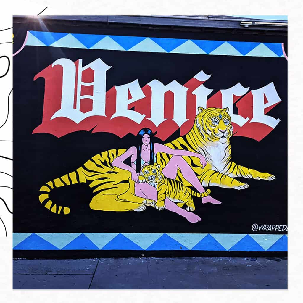
VENICE (@wrappedLA)
This isn’t so much a brand as it is just a nice, eye-catching mural. We loved the colors and simplicity of the design. It had typography all over it but we especially like the juxtaposition of the old gothic lettering with the big cat. It feels pieced together, collage-y or scrap booked. Into it!
We love seeing different typography around the world. If you’re ever walking around and see something you absolutely can’t ignore, send it over to us and will include it in our next article in the series!
