
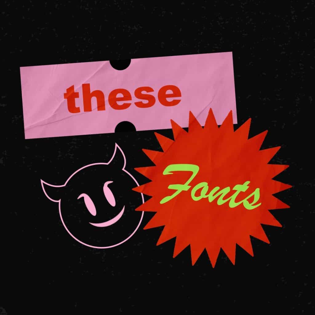
Most fonts are not inherently evil… ?
They were probably created with good intentions. But over time, they have crossed over to the dark side, and for us designers, they stare at us menacingly from the pages of WordPress templates, websites, billboards, and business cards…
When we see these fonts we cringe. Sometimes we gag. Other times they just ruin our perfectly good day. ?
Here are the fonts that have basically crossed into evil territory. We hope you will be generous enough to never allow them into your marketing materials again.
1. Arial
Yes, Arial. There is simply no situation where you should use Arial except in the body of an email or a Google Doc. We’re literally typing Arial right now and it hurts.
Outside of email and Google docs, just don’t do it. Change the font to literally anything else!
Arial is highly readable but about as boring as watching paint dry. Sure, the world is conspiring to force you into the Arial box, but if you still believe in freedom, creativity, love and humanity just tap that little box and scroll down to anything else.
Even Helvetica is better.
2. Brush Script
Just don’t. This awful excuse for “handwriting” fails on so many levels it’s hard to know where to even start.
For one, nothing about it feels natural or handwritten. Nor does it feel like a brush. Just look at that capital G. It’s hideous. And that Q? Even if it didn’t look exactly like a “2” , who would ever write a Q like that? ?
Seriously, friends… Unless you’re being obviously ironic, avoid this font like the plague. It’s truly the definition of evil. We can hear it’s sordid laugh coming from the dark house on the corner of the street where it’s always cloudy.
3. Montserrat
Really? Yes! Montserrat was hot like Hansel a few years ago. You could see Montserrat ubiquitously placed on every web template, PowerPoint deck and digital banner.
Why? Because it’s free. And it reminds us of a font called Gotham, which basically defined our design landscape for the first 10 years of the 21st century.
Gotham was, and still is, an amazing font. ?
Highly readable, refined, clean – a perfect font to bring humanity over from an analogue first world to a digital. While we personally feel Gotham is outdated today, it really did its thing and will probably have a resurgence at some point.
Montserrat is a cheap, poorly executed Gotham. It’s a fake. Using Montserrat is like parading around in Gucci knockoffs during fashion week. It’s just not a good look. Leave Montserrat alone. Forget it exists. Don’t use it!
4. Curlz
Dear lord…why? Just why? ?♀️
5. Impact
Oh boy. Where to begin…Impact is a font we all run into daily –
Impact is the meme font. Yep – that font you see cradling the bosom of every “Ermahgerd” and Distracted Boyfriend image.
It used to be a very respected font… many years ago. But thanks to the meme phenomenon, its lost its way only to be co-opted by the dark forces. It’s the Pepe of fonts and just like Pepe, it is too far gone to ever come back.
RIP Pepe. RIP Impact. Don’t. Use. It. Except on a meme (which you probably shouldn’t be doing anyway) ?
Cheers to better fonts! ?
