
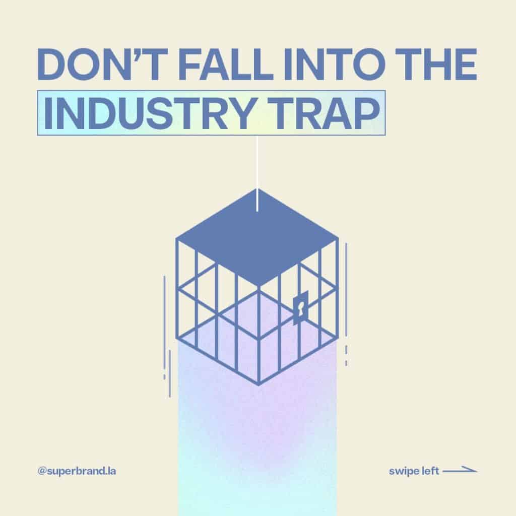
Don’t fall into the trap of what’s expected in your industry
What everyone else is doing – color, fonts, design
As you might have noticed, we are committed to helping our clients to STAND OUT.
We want people to notice you.
We want people to listen to you.
We want people to love you.
We want people to give you money.
One of the things we ALWAYS see is branding that falls into the industry trap.
It’s the idea that because everyone in the industry is doing it one way, we all need to do it the same way.
You own a medical company? Make your website blue.
You’re in Web 3 and Crypto? It’s a purple and blue gradient.
You’re in energy? Green’s your color.
Unless you’re a gas company, then use something with a splash of red.
Here’s the truth – it is important to consider your industry when designing a brand.
BUT this is ALSO the truth. Standing out is always more important than blending in.
The answer?
Create a brand that has a distinctive look that also nods to your industry.
Change the color, but keep some imagery.
Change the icons but keep the language.
Change the language, change the color, but keep some iconography.
When designing a logo, we often line up the logos from other companies in the space and assess our options. We want the logo to stand out, but also fit in.
One way is to change all the elements, but keep the quality. Create something unique, but still authoritative.
Check out this boxed wine company… they have the wine aesthetic, but they changed the form factor of the box. It’s clever. And it’s UNIQUE
Sometimes it just takes ONE LITTLE THING to turn what’s expected on its head.
What’s your thing that makes you unique?
Ok, lesson over.
Get to it. Or call us and we’ll help.
