Typography in the Wild – NYC Edition
Some cities hide the good stuff for those in the know (LA, I’m talking to you!). But NY lays itself bare in front of anyone who takes the time to look. ?
One of the things I love looking at in NY is the graphics. From posters, to shop signs, stickers, museum exhibitions – graphics and typography are everywhere! ?
As a designer, I can walk the streets all day just taking inspiration from the incredible output of human creativity.
Last week, as I walked around the city during a week-long trip visiting family and friends, I snapped a few photos of typography I thought were cool, modern and grabbed my eye…
Here are a few selections and why I took the time to photograph ? them:
1. CEDRIC’S

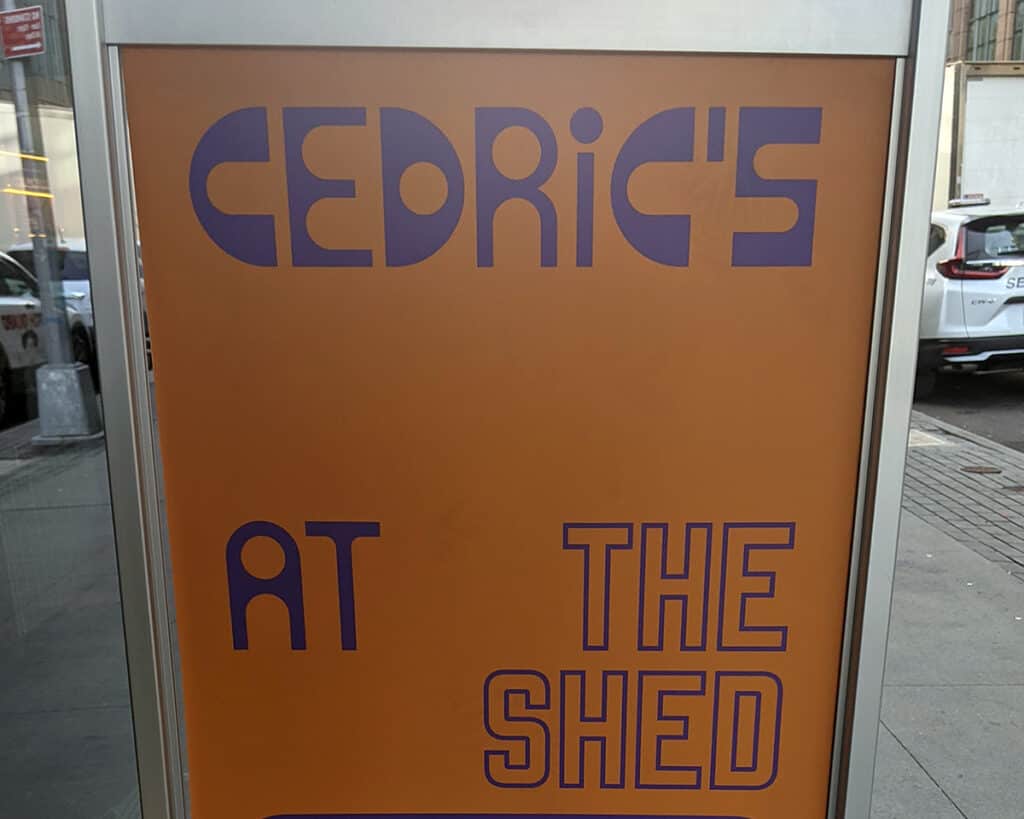
This was the logo for the restaurant at an art space called ‘The Shed’ where I saw a couple of great exhibitions. The font is wonky, the letters don’t match, the weighting is completely off… but it made me feel something. It’s fun and quirky and considering how well designed the place was, it felt like a nice contrast to the overtly artsy interior of the venue.
2.MINJUKIM

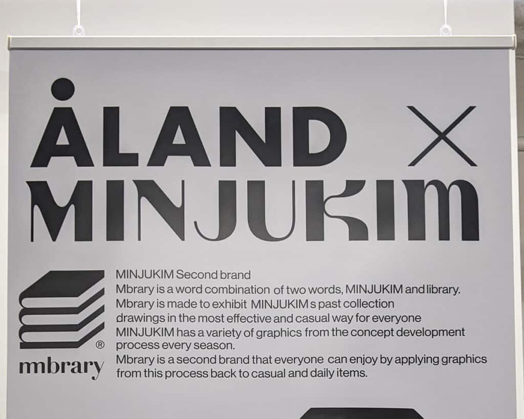
I LOVE this font! Some great curves. Very modern, playful and it pairs so well with the Aland font. This was a Korean goods store in Williamsburg – I was definitely not cool enough or skinny enough to shop there, but I enjoyed the simple style, the black and white typography and the unique aesthetic of the place. It felt a bit like the Korean version of American Apparel.
3. FRAGILE CULTURE

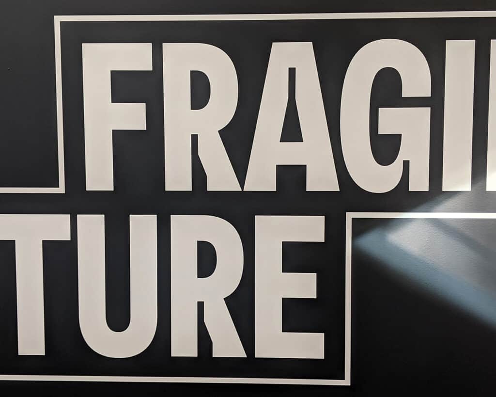
This text was part of the title and description of one of the exhibits at The Shed. I love the cutaways on the R, the A and the G. I’ve been seeing these cutaways a lot lately and they’re cool. This font takes a classic sans serif and gives it a modern update with a digital, coding type vibe.
4. WTHN

This is clever. Notice how the small t acts as both a t and an i? It’s a simple take on a common word that helps it stand out. Very nice…
5. BANG BANG

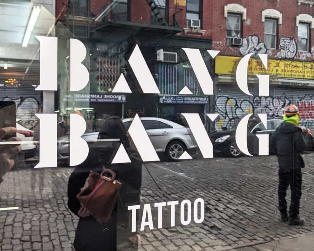
As I look back at this one, it’s not my favorite of the bunch. But, I do think that considering the context, it’s interesting. It’s not the typical font you’d see for a tattoo shop logo. Also, it reminds me of a logo my father designed many years ago for his woodworking business.
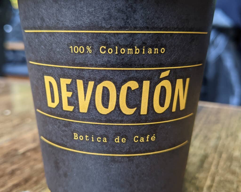
6. DEVOCION

Those are my picks from my trip… which ones speak to you and which don’t? I’d love to hear your take!
More from the Blog...
February 27, 2023
What Opportunities Are You Missing Every Day?
February 23, 2023
Our Client Disappeared! Now What?
February 23, 2023
Does Your Brand Have a ‘Genre’?
February 23, 2023
Branding Is Also for B2Bs. Here’s Why!
November 30, 2022
The Difference Between a Brand Story and an Origin Story
November 25, 2022
What We Learned at Token2049 in Singapore
November 21, 2022
The Industry Trap
November 17, 2022
Your Style Sucks
November 14, 2022
Risky Business
November 10, 2022
Stand The F*** Out
October 14, 2022
Marketing is Bullsh*t
October 7, 2022
FOSO – A Worse Pandemic is Here
October 4, 2022
Who, What, How and Why
September 30, 2022
Branding in Three’s
September 26, 2022
Turning adversity into opportunity
September 22, 2022
Have no FUD!! (fear, uncertainty and doubt)
September 19, 2022
This ONE thing is what it’s all about
September 14, 2022
They’re paying for your expertise and leadership!
September 10, 2022
Together toward our IMAGINED future
September 6, 2022
Stop trying to NOT be an artist
September 2, 2022
Is indecision killing your brand?
August 30, 2022
Branding IS sales
August 26, 2022
Are you an over-communicator?
August 19, 2022
Build your world and own it! What world are you living in?
August 17, 2022
Finding the balance
August 10, 2022
5 Key Takeaways From NFT | LA
June 24, 2022
Typography in the Wild – Psychedelic Edition
June 24, 2022
NFTs and Branding
June 24, 2022
When is the right time to brand
June 24, 2022
Get serious about your business
June 24, 2022
Make Marketing Fun Again
March 8, 2022
Typography in the Wild!! Venice Beach Edition
January 31, 2022
2022 is the year of having a point of view
January 22, 2022
You Should Be Branding!
January 22, 2022
5 Fonts SOOO Bad, They’re Evil
January 22, 2022
T-Shirt Worthy! Brands We Love
January 22, 2022
DCentral Miami & Art Basel – 5 Key NFT Takeaways
January 6, 2022
5 Band Logos We Absolutely Love
May 26, 2020
Forget Brand Archetypes! Try this…
May 26, 2020
The ROI of Brand Strategy
September 4, 2019
Is it worth it to create a Brand Experience?
August 9, 2019
The Three Absolutely Unbreakable Rules of Great Branding
July 4, 2019
What will you BECOME?
May 1, 2019
Your Online Story and The Line of Trust
December 6, 2018
Why Yellow Is By Far the Best Color For Your Logo
December 4, 2018
Be Specific. Impact Lies in Concrete Language.
November 28, 2018
Practice Creativity with These Book Recommendations
February 19, 2018
10x Creativity by Not Judging Your Own Ideas
October 31, 2017
Go from Reactive to Proactive and Write Your Own Future
October 24, 2017
Forget Content. Context Is How to Get People to Remember You
October 3, 2017
Why I Spent Three Days Alone in the Wilderness
June 13, 2017
The Power of Storytelling Beyond Sales
May 23, 2017
Just to Clarify, Branding is NOT Just Your Logo
May 17, 2017
A Small Step to Failure
May 7, 2017
It IS Important
May 6, 2017
The Clarity of Purpose Brand Strategy…
May 4, 2017
Go for No…
November 14, 2016
Being productive doesn’t mean being a machine…
November 14, 2016