Typography in the Wild!! Venice Beach Edition
Our fonts in the wild series is back!! We went scouting for our favorite logos and fonts on the now infamous Abbot Kinney in Venice Beach, California.
We’ve seen Abbot Kinney’s come-up over the years and it’s been nothing less than extraordinary.
This little stretch of angled road used to be home to a dive bar and two smoke shops. Now it houses some of the trendiest shops in LA and was recently voted #1 shopping street in the country. What?!?
Interestingly, many of the logos and fonts we saw here are VERY simple. It makes sense, as luxury brands generally rely more on simplicity, and efficiency in communication has often been the hallmark of high end goods.
But with that said – here are the marks that caught our eye!
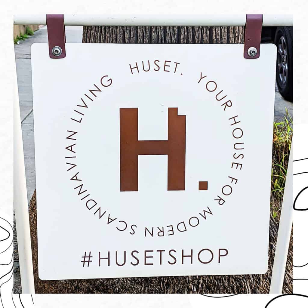
HUSET
How cool is the tiny block cut out of the H to form the period? If you were to see this logo on its own, could you guess what the brand was selling? To us, the H with the cutout takes on the form of a chair. And with this small block there’s definitely a feeling of building a home, or putting things together. This logo makes a ton of sense for a home goods brand. Very clever.
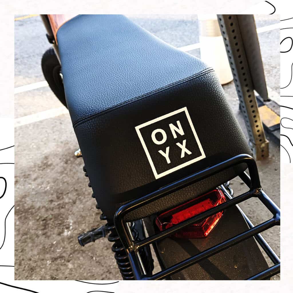
ONYX
Nothing revolutionary here – but the simplicity of the design and the placement on the back of this e-bike seat really stood out for us. As e-bikes have become more popular and electric motors more available, they’ve not only changed the way we commute, they’ve also become ripe ground for interesting design. This particular e-bike had very simple lines and a beautiful wood panel housing the battery. It felt very elegant, and the classic box logo played very well with the look.
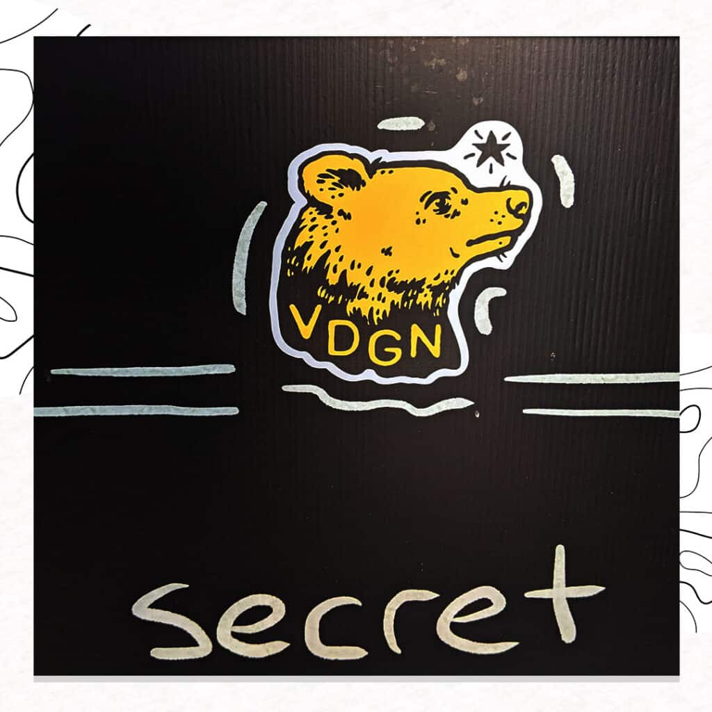
VARDAGEN
We love hand drawn logos and brands that can embrace naive and playful art. Vardagen’s wares are all screen printed with cool, hand drawn artwork that has a bit of punk/underground art influence. We love how they simplified this mark to just four letters and the punk attitude of their brand in general.
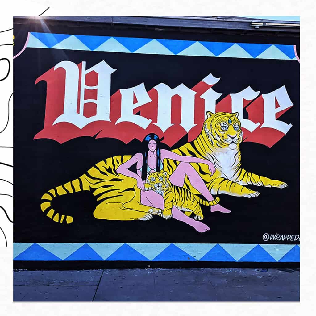
VENICE (@wrappedLA)
This isn’t so much a brand as it is just a nice, eye-catching mural. We loved the colors and simplicity of the design. It had typography all over it but we especially like the juxtaposition of the old gothic lettering with the big cat. It feels pieced together, collage-y or scrap booked. Into it!
We love seeing different typography around the world. If you’re ever walking around and see something you absolutely can’t ignore, send it over to us and will include it in our next article in the series!
More from the Blog...
February 27, 2023
What Opportunities Are You Missing Every Day?
February 23, 2023
Our Client Disappeared! Now What?
February 23, 2023
Does Your Brand Have a ‘Genre’?
February 23, 2023
Branding Is Also for B2Bs. Here’s Why!
November 30, 2022
The Difference Between a Brand Story and an Origin Story
November 25, 2022
What We Learned at Token2049 in Singapore
November 21, 2022
The Industry Trap
November 17, 2022
Your Style Sucks
November 14, 2022
Risky Business
November 10, 2022
Stand The F*** Out
October 14, 2022
Marketing is Bullsh*t
October 7, 2022
FOSO – A Worse Pandemic is Here
October 4, 2022
Who, What, How and Why
September 30, 2022
Branding in Three’s
September 26, 2022
Turning adversity into opportunity
September 22, 2022
Have no FUD!! (fear, uncertainty and doubt)
September 19, 2022
This ONE thing is what it’s all about
September 14, 2022
They’re paying for your expertise and leadership!
September 10, 2022
Together toward our IMAGINED future
September 6, 2022
Stop trying to NOT be an artist
September 2, 2022
Is indecision killing your brand?
August 30, 2022
Branding IS sales
August 26, 2022
Are you an over-communicator?
August 19, 2022
Build your world and own it! What world are you living in?
August 17, 2022
Finding the balance
August 10, 2022
5 Key Takeaways From NFT | LA
June 24, 2022
Typography in the Wild – Psychedelic Edition
June 24, 2022
NFTs and Branding
June 24, 2022
When is the right time to brand
June 24, 2022
Get serious about your business
June 24, 2022
Make Marketing Fun Again
January 31, 2022
2022 is the year of having a point of view
January 22, 2022
Typography in the Wild – NYC Edition
January 22, 2022
You Should Be Branding!
January 22, 2022
5 Fonts SOOO Bad, They’re Evil
January 22, 2022
T-Shirt Worthy! Brands We Love
January 22, 2022
DCentral Miami & Art Basel – 5 Key NFT Takeaways
January 6, 2022
5 Band Logos We Absolutely Love
May 26, 2020
Forget Brand Archetypes! Try this…
May 26, 2020
The ROI of Brand Strategy
September 4, 2019
Is it worth it to create a Brand Experience?
August 9, 2019
The Three Absolutely Unbreakable Rules of Great Branding
July 4, 2019
What will you BECOME?
May 1, 2019
Your Online Story and The Line of Trust
December 6, 2018
Why Yellow Is By Far the Best Color For Your Logo
December 4, 2018
Be Specific. Impact Lies in Concrete Language.
November 28, 2018
Practice Creativity with These Book Recommendations
February 19, 2018
10x Creativity by Not Judging Your Own Ideas
October 31, 2017
Go from Reactive to Proactive and Write Your Own Future
October 24, 2017
Forget Content. Context Is How to Get People to Remember You
October 3, 2017
Why I Spent Three Days Alone in the Wilderness
June 13, 2017
The Power of Storytelling Beyond Sales
May 23, 2017
Just to Clarify, Branding is NOT Just Your Logo
May 17, 2017
A Small Step to Failure
May 7, 2017
It IS Important
May 6, 2017
The Clarity of Purpose Brand Strategy…
May 4, 2017
Go for No…
November 14, 2016
Being productive doesn’t mean being a machine…
November 14, 2016